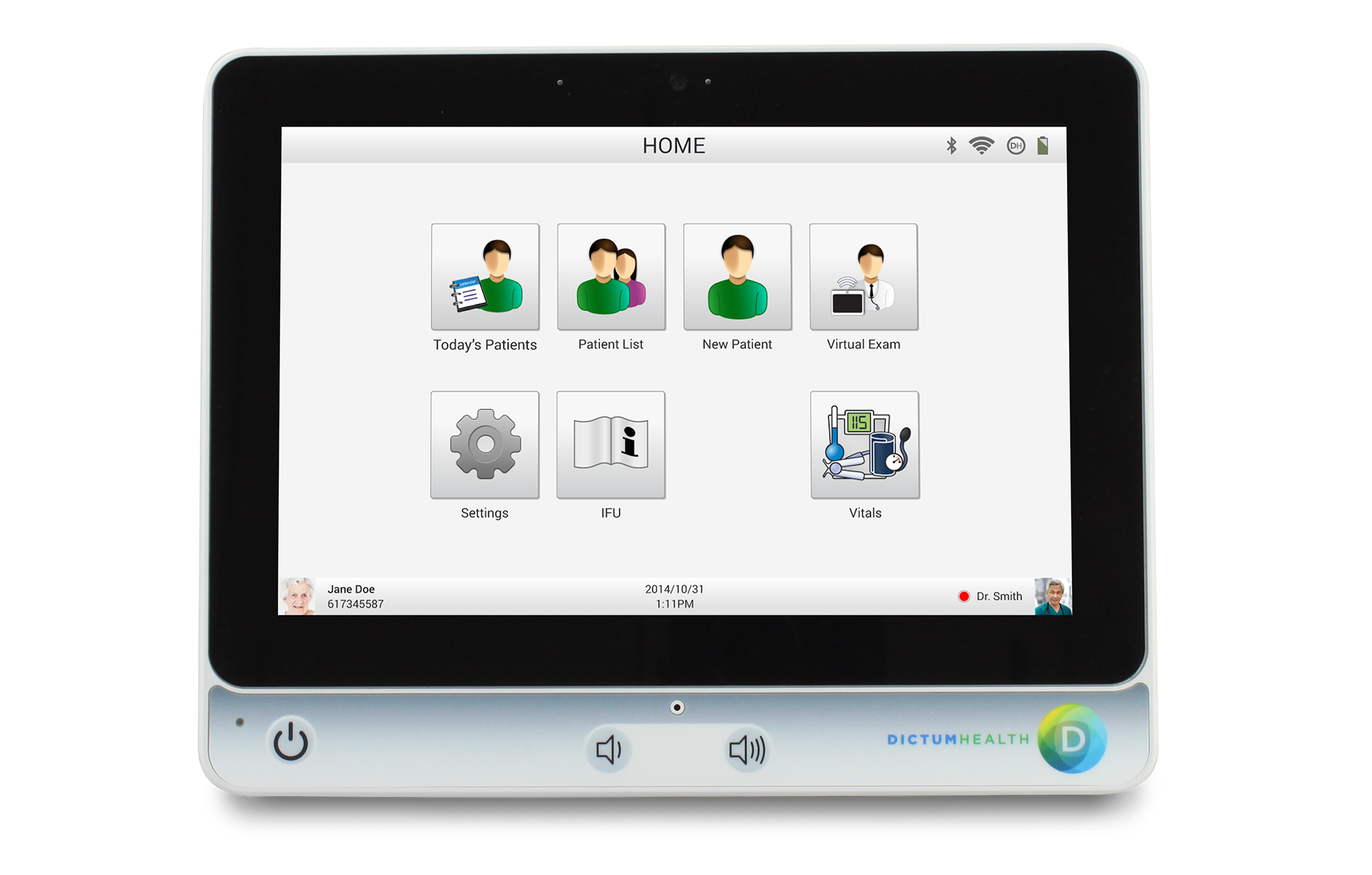
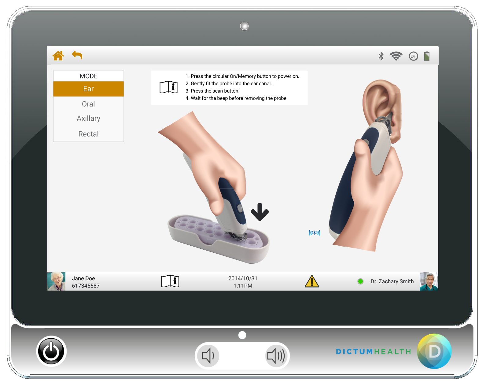
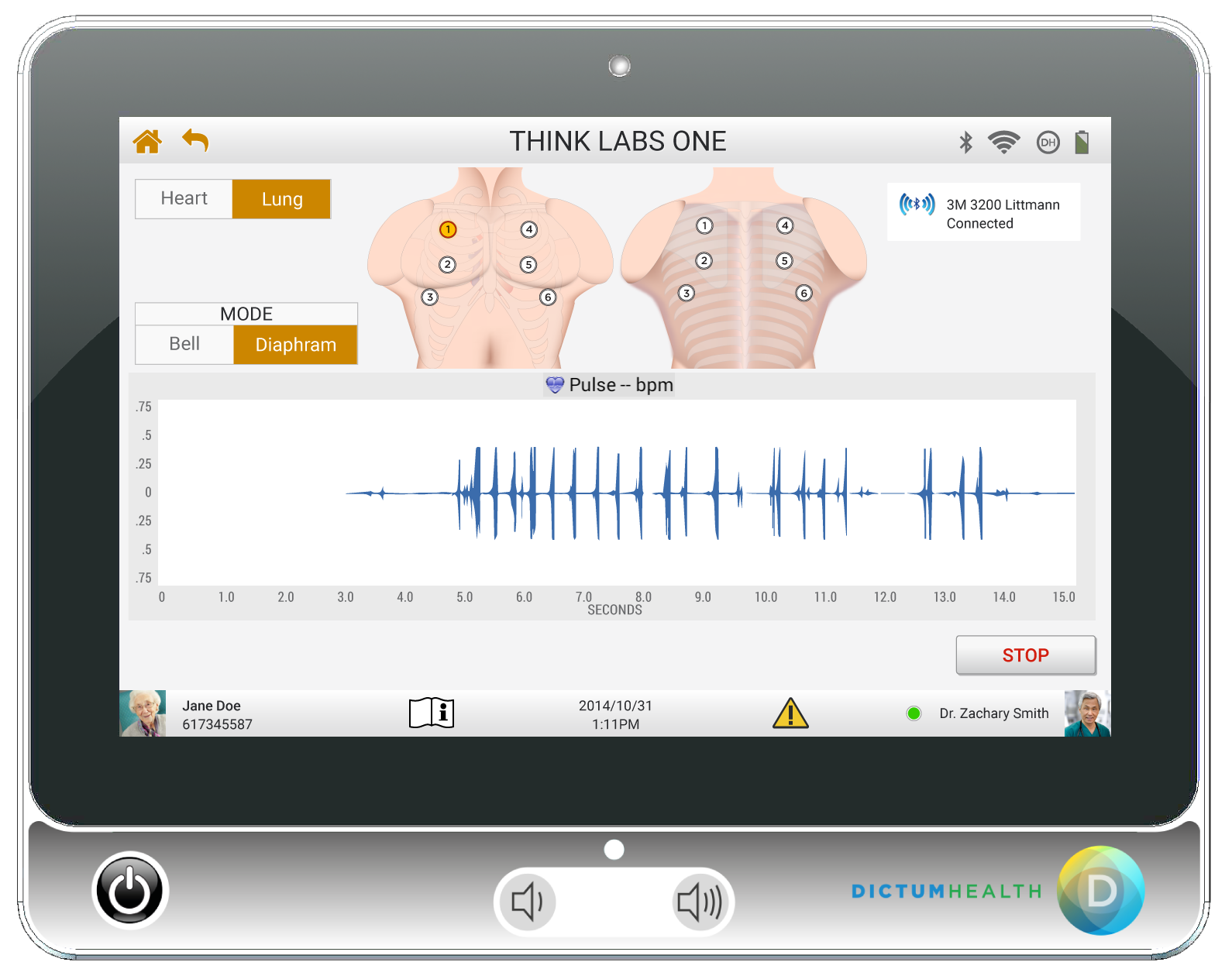
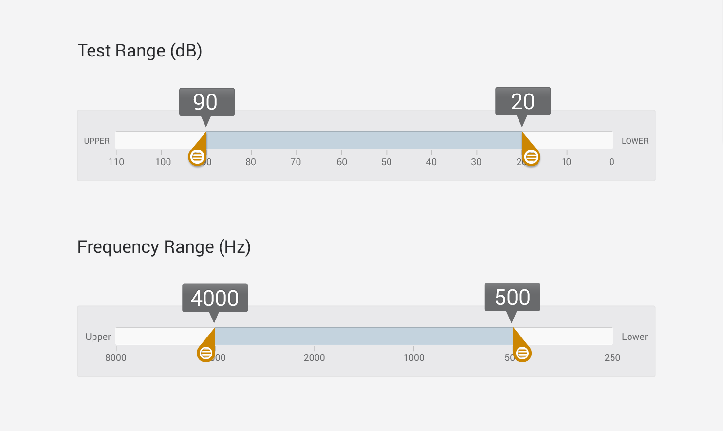
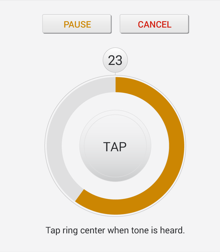
The IDM100 Medical Tablet is an FDA-approved Type 2, HIPAA-compliant clinical device for mobile patient care. It contains 12 clinical tests, including up to 12-lead ECG, Spirometry, Respiratory, Audiometry, and Laryngoscope.
I started working at Dictum two years into development. They asked me to "redesign" their currently platform, mostly working with existing assets.
They preferred to work from high-res comps rather than wireframes. I would show the product manager some iterations along the way, but the CEO always wanted to see final art before requesting changes.
Research
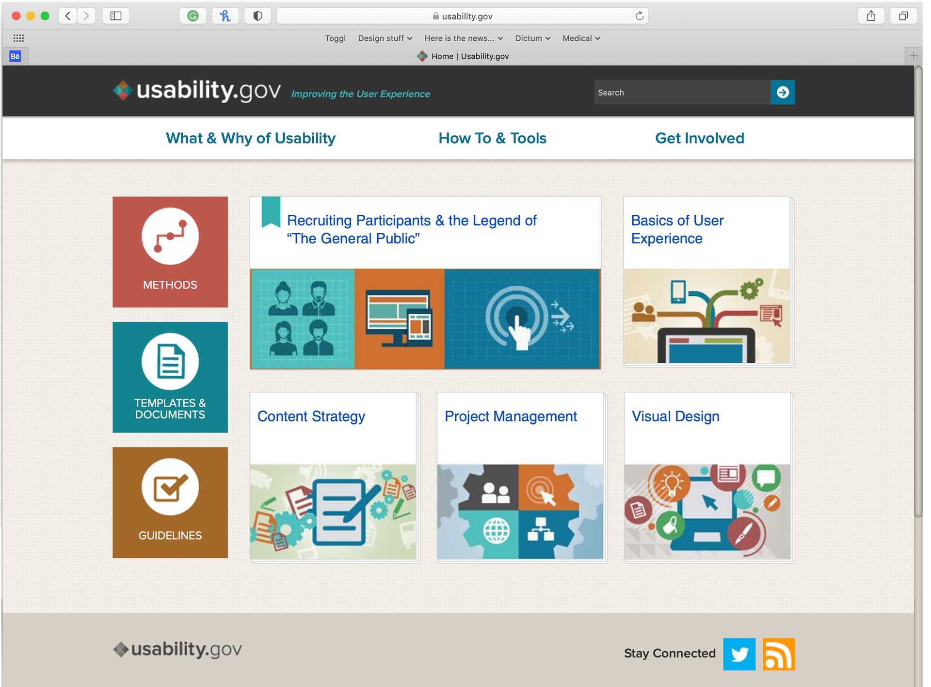
Besides looking at looking for visual design inspiration, I also needed to consider guidelines from the FDA, and adapted processes from usability.gov.
Planning
I started by examining the hierarchy of the application, producing a sitemap and flowchart. Working with the product manager we started to identify redundancy and flow issues. I assigned a number to each page and use the same identifier throughout the process, for instance, when building a prototype.
The changes were presented to the CEO and development team. Some of the changes were made, some were ignored, and some are still waiting to be implemented, seven years later. I found out after the product manager left that the development team already had a sitemap and hadn't told anyone, nor mentioned it when this new material was shown.
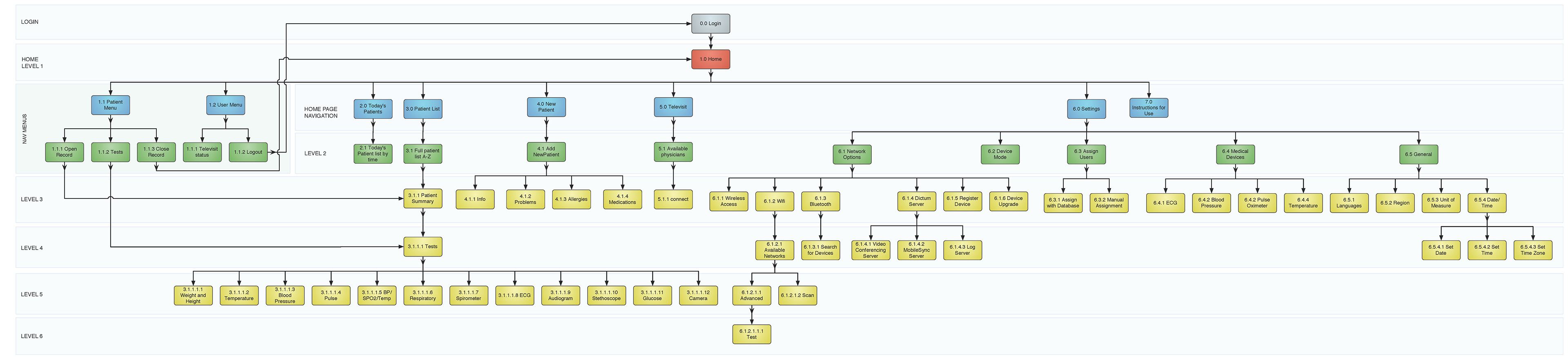
sitemap of the existing application
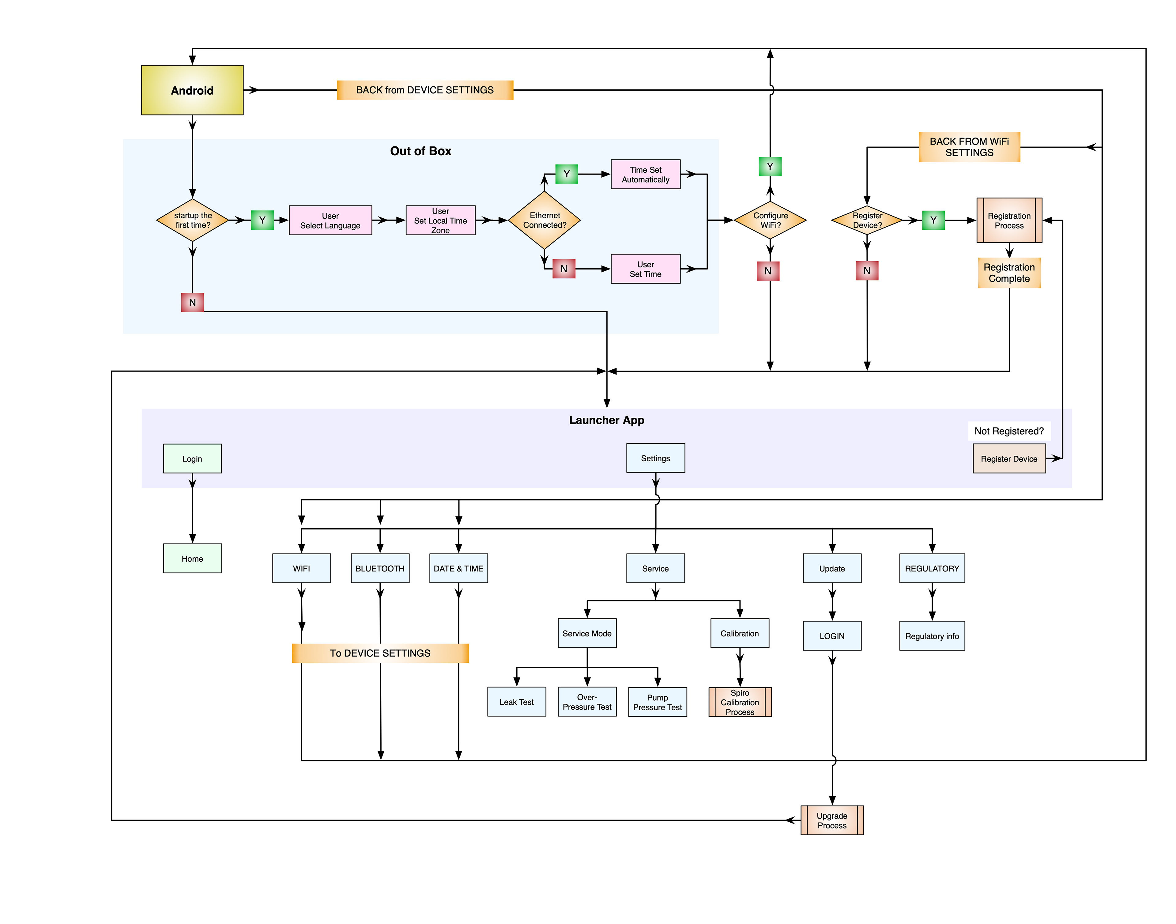
flowchart breakdown of the login process
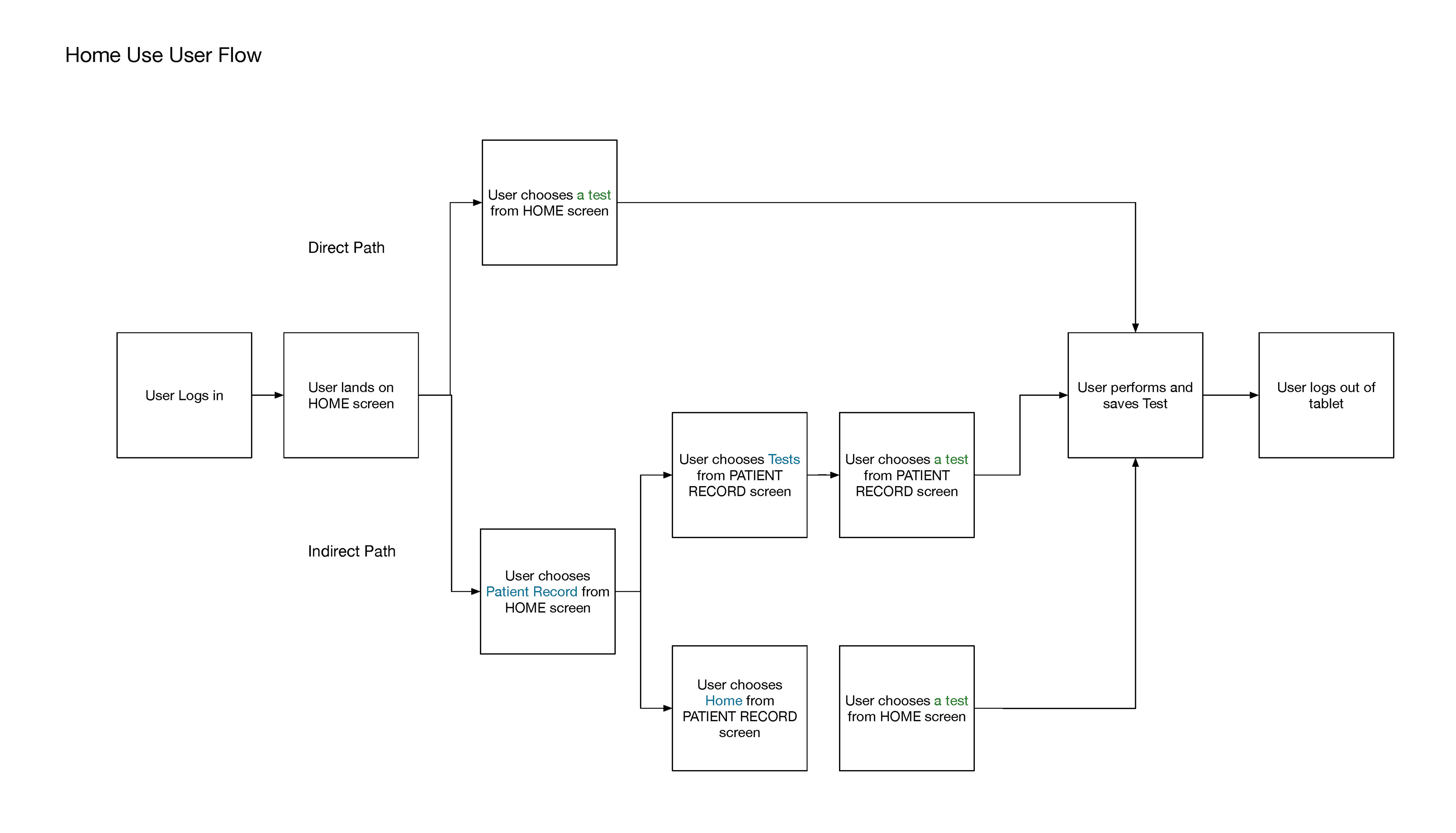
User Journey Map
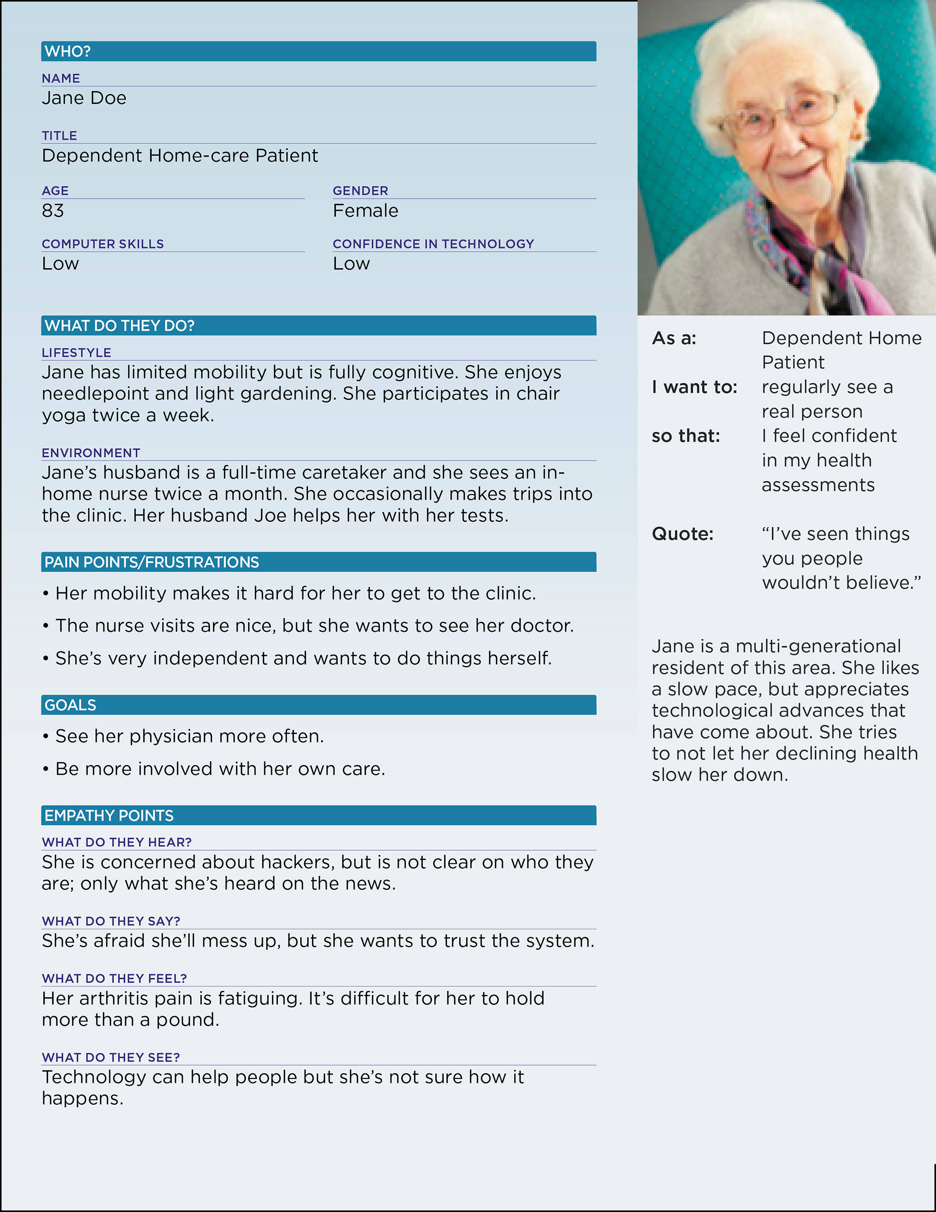
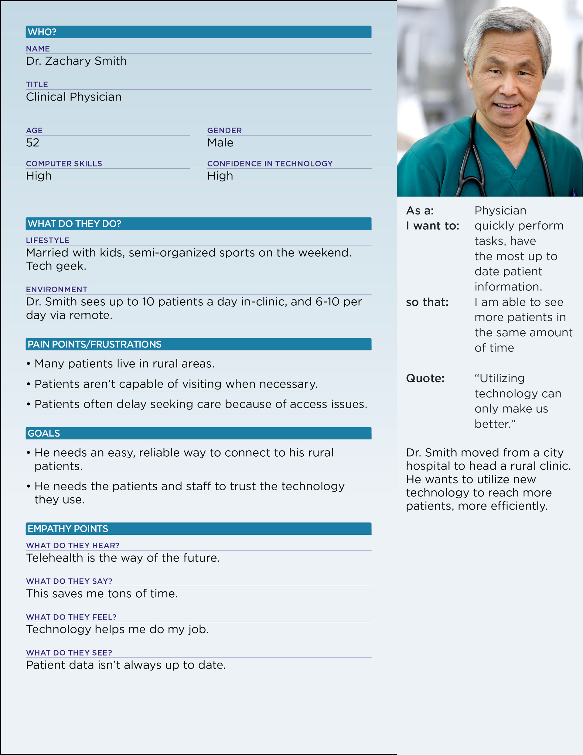
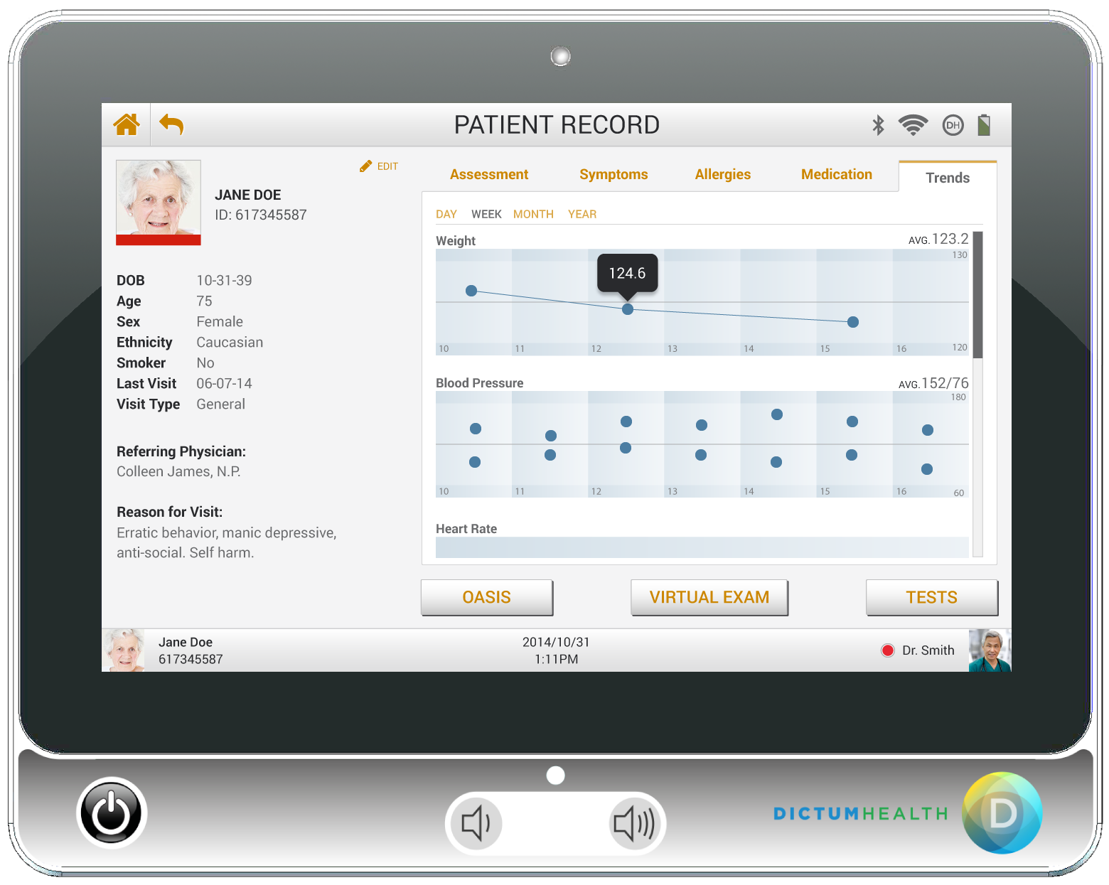
The IDM100 is a clinical device, but it is also a portable device meant to be for use by patients. I produced personas to help me identify issues and needs for primary use case types -- an elderly patient, and a clinical doctor.
Visual Design
The visual design when I first started had been done in Powerpoint.
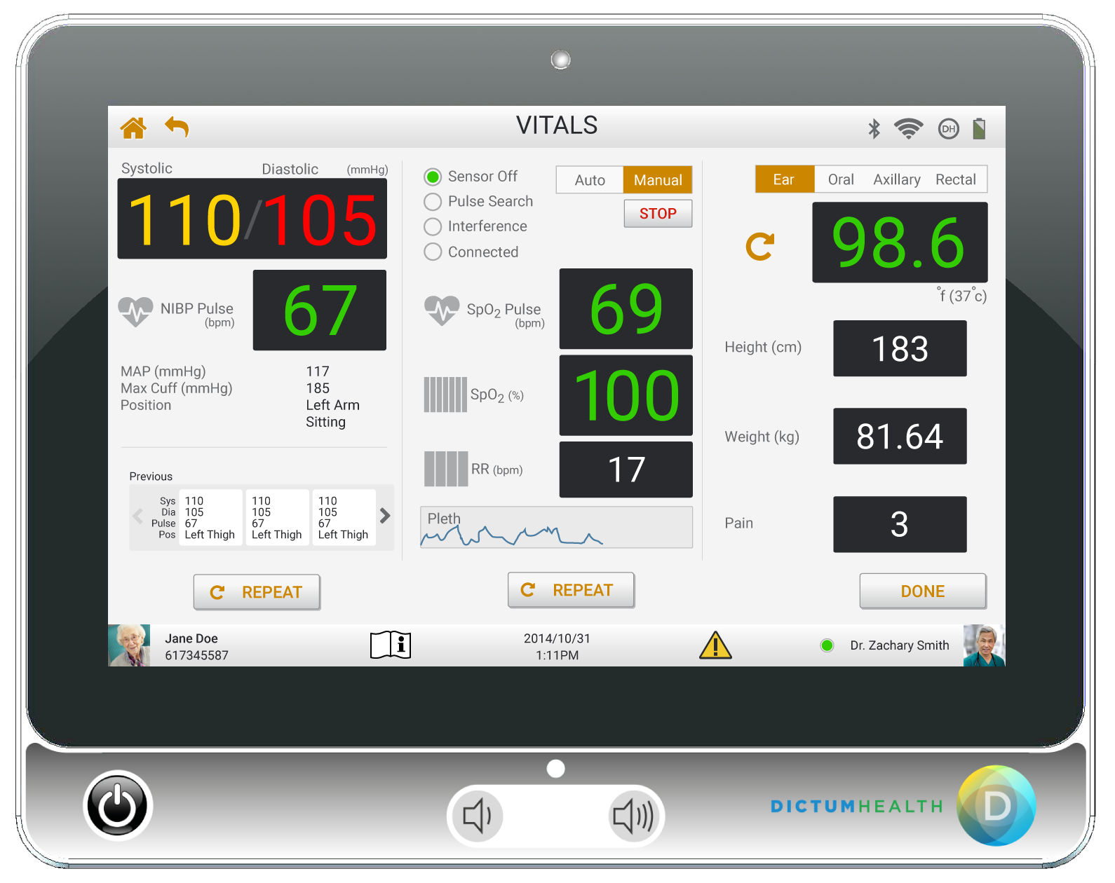
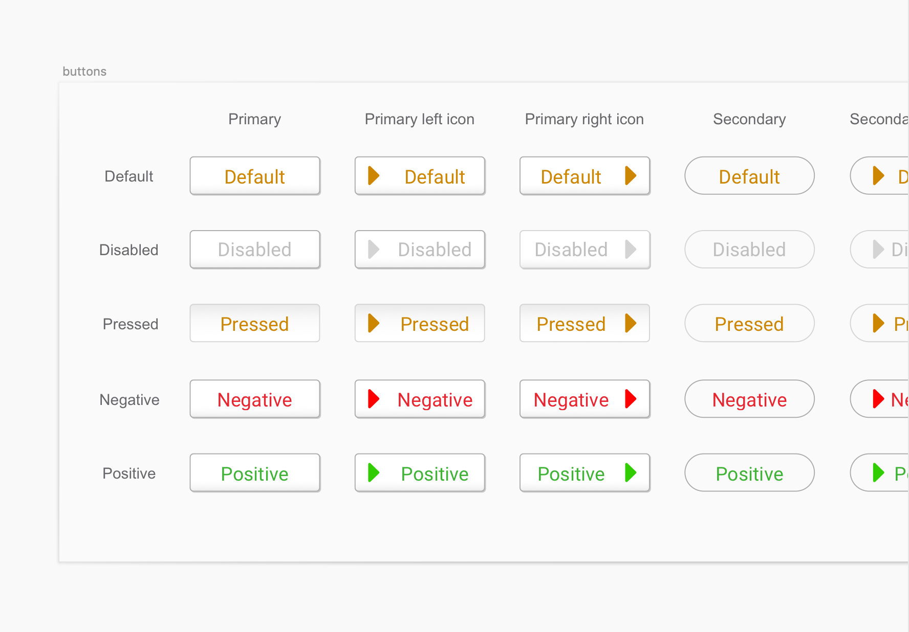
The first thing i wanted to do visually was to completely neutralize the background elements and focus color intentionally for patient feedback and direction.
As this idea was expanded upon, other requirements started to be revealed, like the product manager wanting the test icons to be color coded to match the cables of the devices they were related to. That requirement left very little room in the color palette for actionable items, like buttons and links. the team finally settled on a "neutral" palette, using a dark orange for the links and buttons.
Another requirement was to re-use as many elements as possible. For instance, they wanted new icons for the tests, but didn't want new icons for the home page.
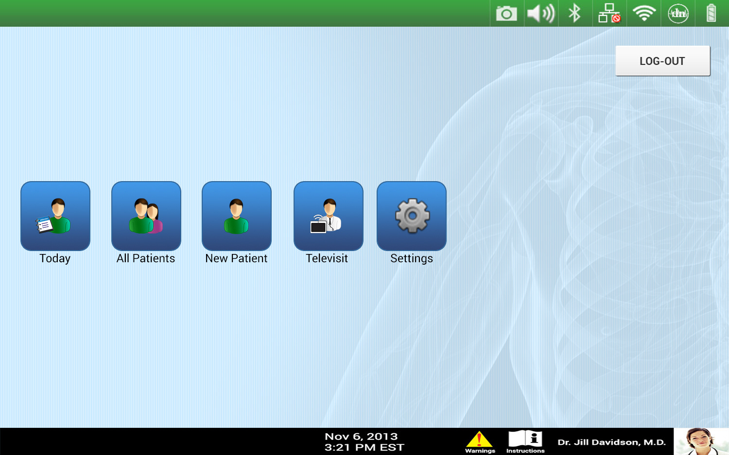
The visual design when I started
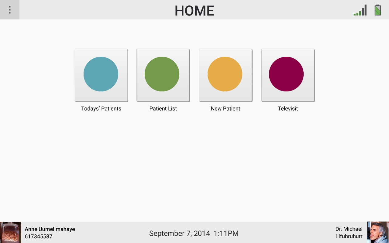
my first pass redesign
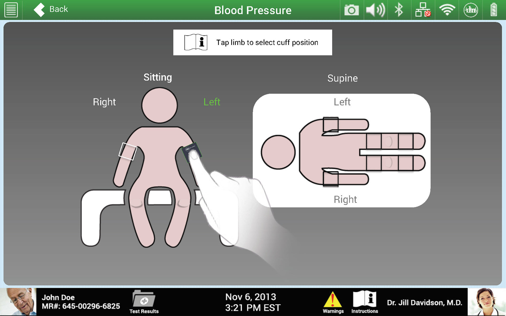
previous blood pressure select
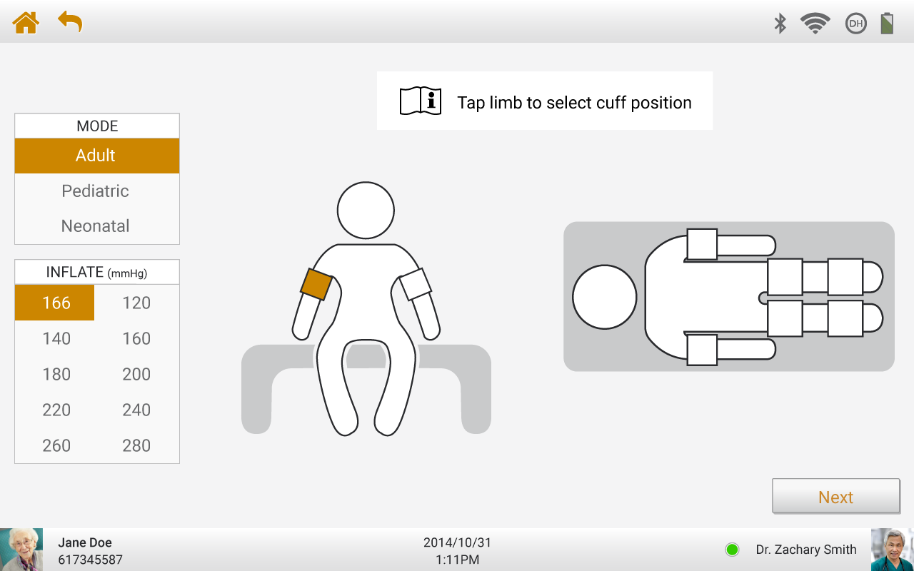
Redesigned blood pressure select
